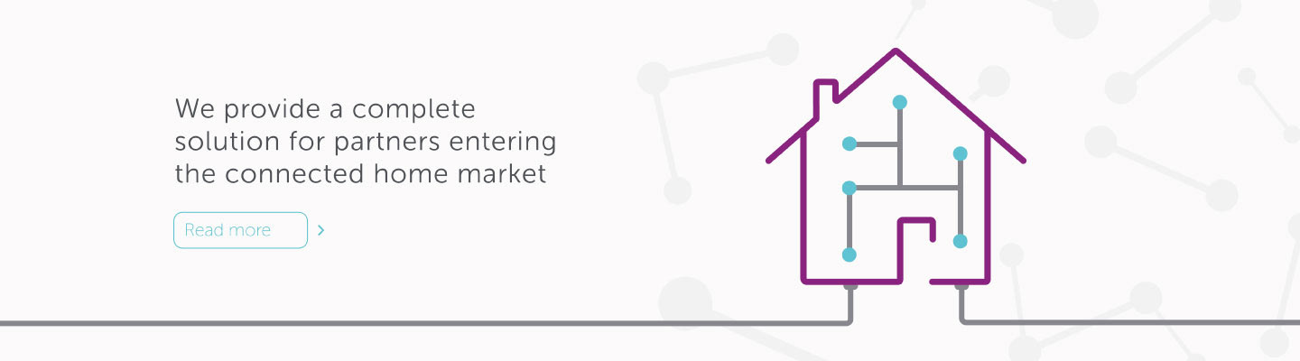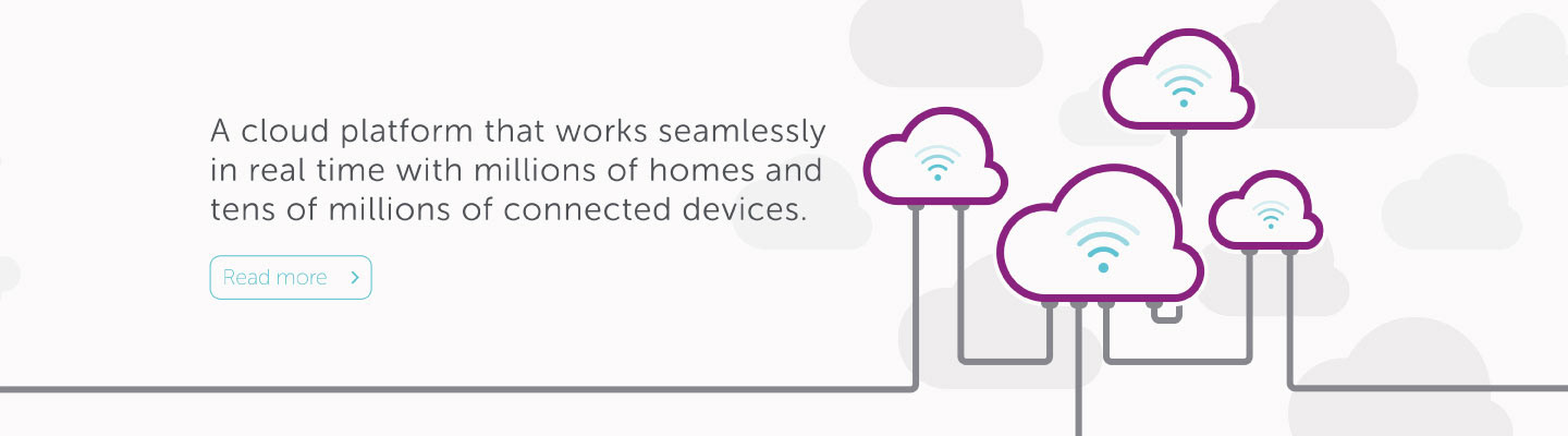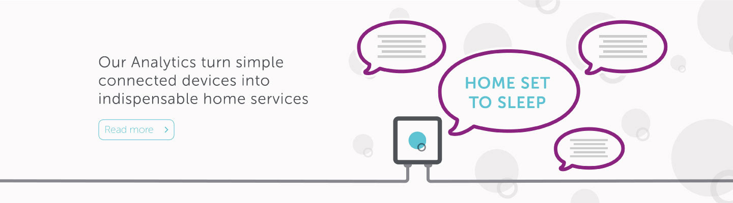


AlertMe was founded in 2006 and provides a scalable platform to connect an ecosystem of devices and appliances in the home. It provides an end to end service allowing devices and applications to work together seamlessly.
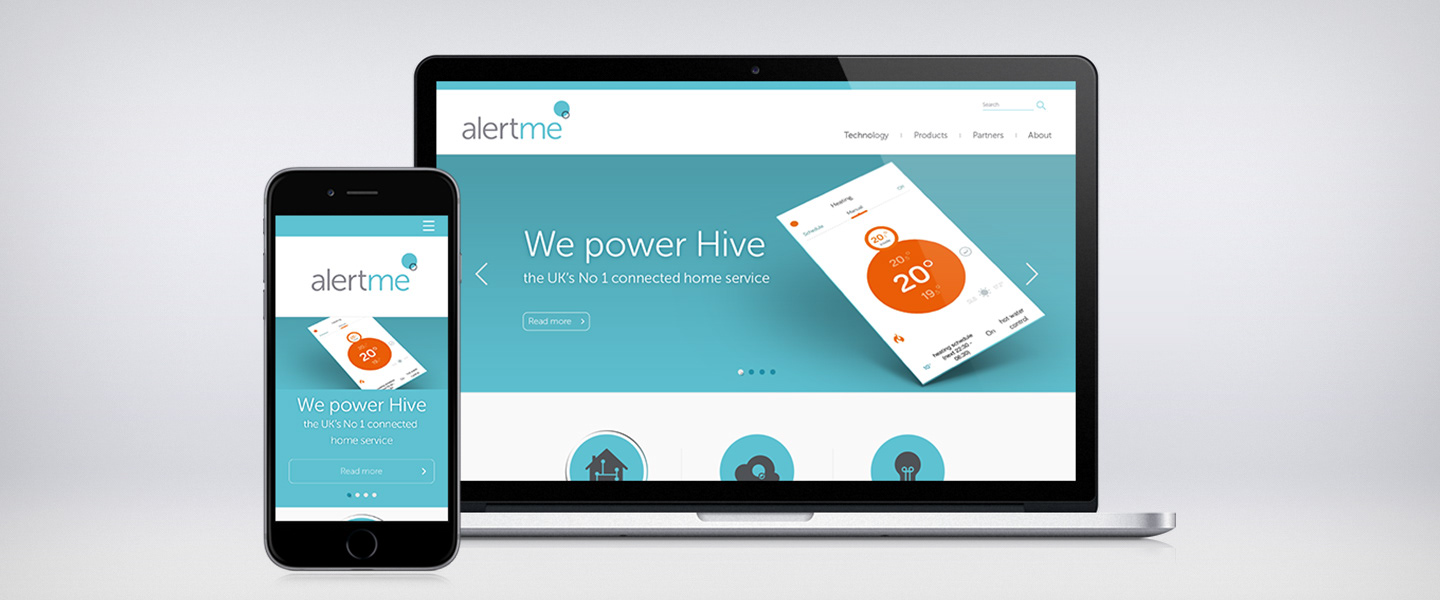
The old site and brand was outdated, non responsive and didn't position AlertMe as the technological pioneer that it was. We took the old mark and palette and freshened it up, bringing a softer palette that spoke of their innovative and ecological nature, that still allowed for them to stand out and embrace the colour that they had done in their original mark.
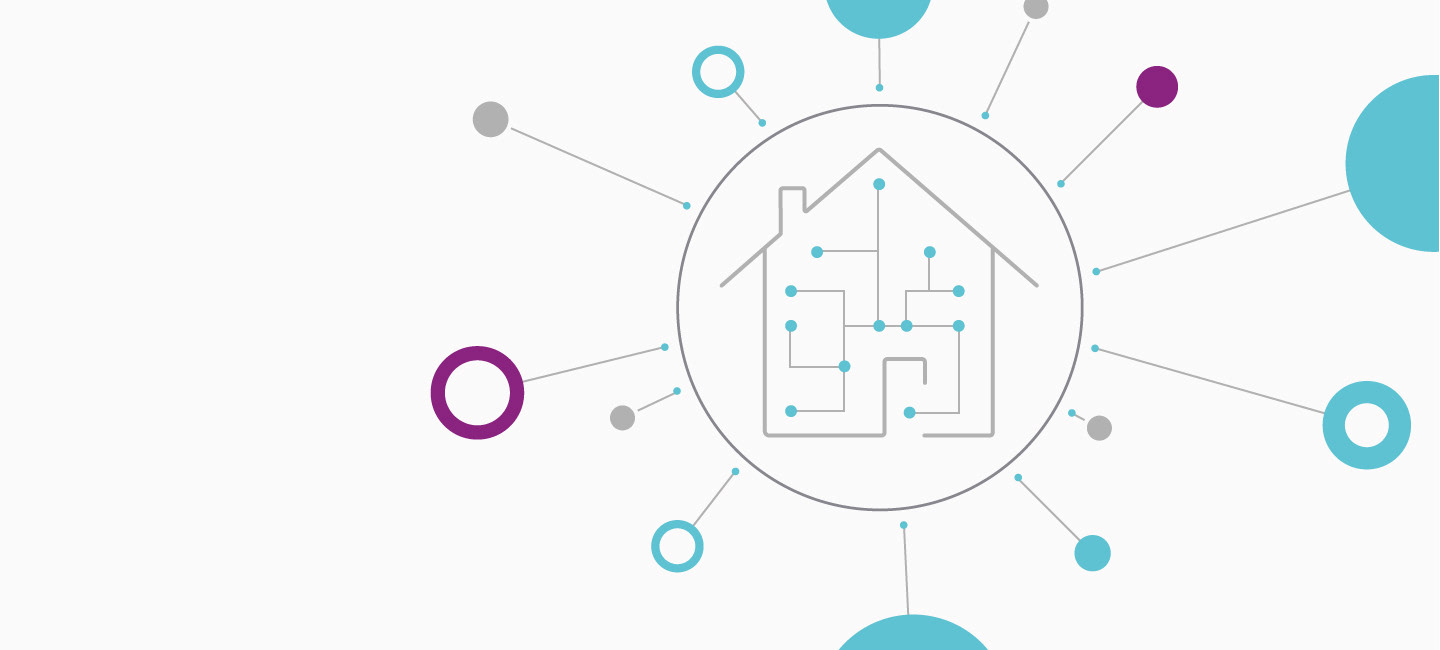
The AlertMe mark that floats above the word work mark, symbolically represents the connection it makes to your home and how it creates a mini ecosystem, helping users to live their lives in a simpler fashion.
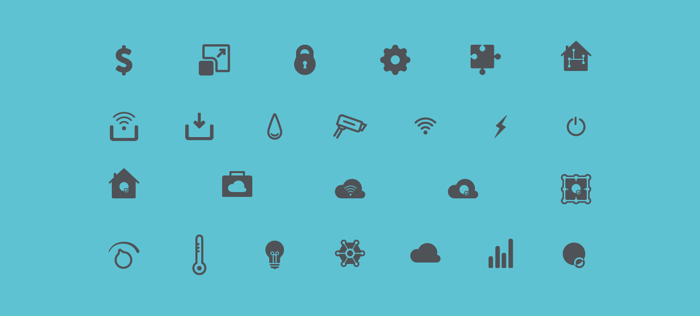
An illustration style was adopted, flat and minimal which was approachable, and as easy to recognise as possible as the technology that underpinned the product was insanely complex. The iconography that led a lot of the navigation and helped to bring understanding and context to the site was based around the curved forms of the mark, breeding consistency across all the visual forms of the identity.
On top of the innovative nature of AlertMe and their technologies this responsive website and rebrand helped propel AlertMe into an acquisition by British Gas, in a £65m deal.
A statement on the company holding page now reads:
"British Gas have acquired AlertMe to create the UK’s leading connected homes provider. This exciting move brings together British Gas’ ability to innovate for customers with AlertMe’s next generation Internet of Things technology and expertise. The acquisition has created a highly experienced and fully integrated team which will now accelerate the development of new connected home services in the UK and worldwide."