


I was asked by bassist Sean to pitch to the band a minimal typographic identity that they could use in preparation for their upcoming recordings and gig appearances. Having rehearsed and refined their sound over the previous year, the required a visual solution that was as polished as their set. After pitching pages of hand drawn script in numerous styles that all had tonnes of character, it was decided that a cleaner and more precise look was required to highlight the maturity and professionalism of the band, while retaining a certain charm.
Following on from the success of the initial brand identity, Picture Haus approached me to help co-ordinate their creative direction for the visual aspects of their upcoming E.P and single releases. They had two singles that were nearing completion with two more in the pipeline to complete their first release.
The theme of the E.P was school yard heartbreak and the songs, poignant with emotive guitar riffs and haunting lyrics rang true of this theme. If your counting, by far my favourite track.
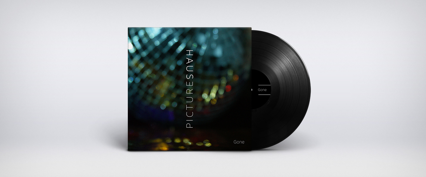
Working closely with two key band members we decided to drive the direction of the visuals in a subtle and slightly abstracted view of a typical school disco, where so many a young boys heart was broken. With the lights, smoke machines, glitter balls, each single would display a key component of the disco, with the E.P artwork bringing the whole scene into clear focus.
The band and their singles have received a great reception, playing at festivals, gaining radio airtime and playing numerous venues in the south.


Available on iTunes & Spotify now. If you like the ephemeral tonal vibes of 1975 and the like. Go give these guys a little check out now.
