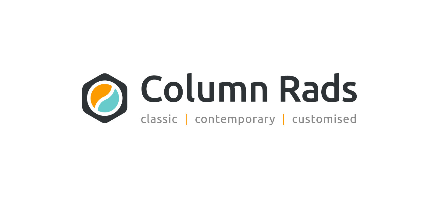


Column Rads a company under the APP umbrella that specialised in column radiators was looking dated and didn't have an identity that was elevated to the premium radiator brand that they were becoming.
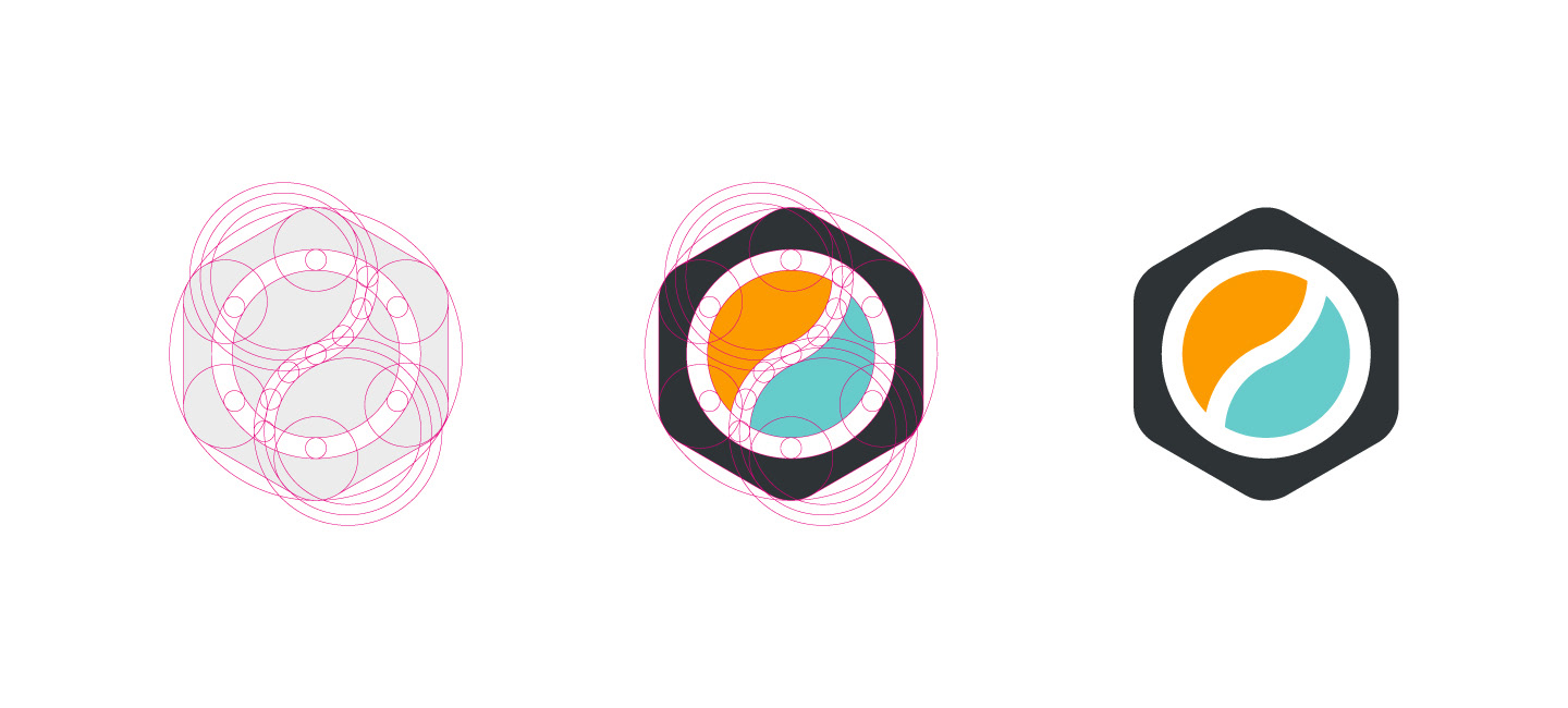
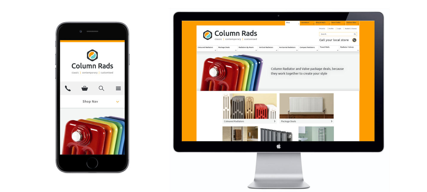
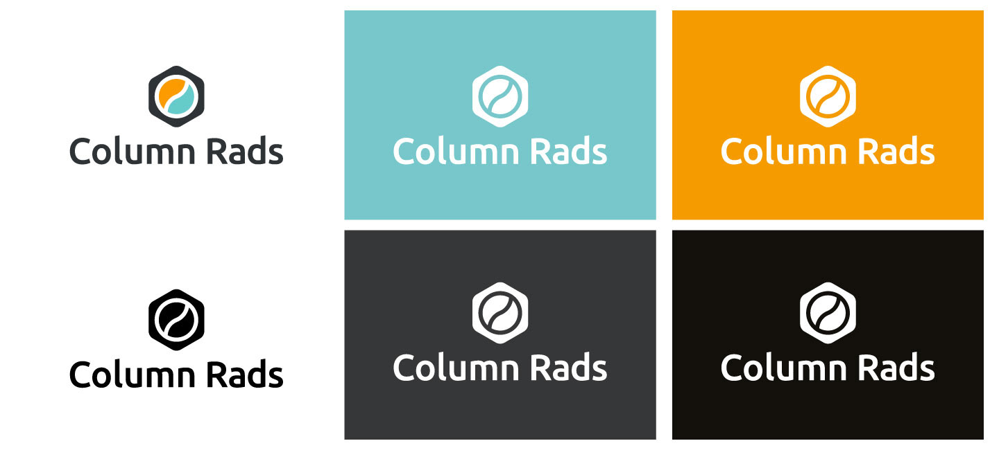
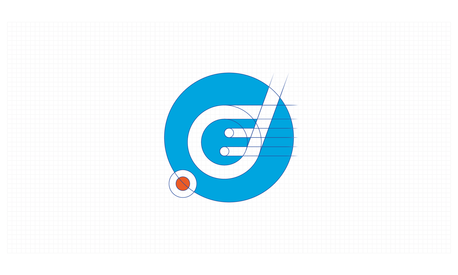
They needed an identity that worked across both their digital and printed mediums, from packaging to the site logo and favicon. To capture to these requirements while keeping the visual aesthetics clean and minimal we looked to the radiators themselves and identified the bleed nut as a consistent and integral part of the radiators construction.
A subtle reference, but one that gave the identity a firm grounding that meant we could frame the 'heat / water' element within, with a striking colour contrast.
The contrtsutcion of the identity is build upon mathematical principle and the considered approach has been married up with optical precision to deliver a strong mark that sits alongside the word mark in both a horizontal and vertical stack.
Full guidelines were drafted up and website visuals were created to direct the in house development team on the look and feel of the site.