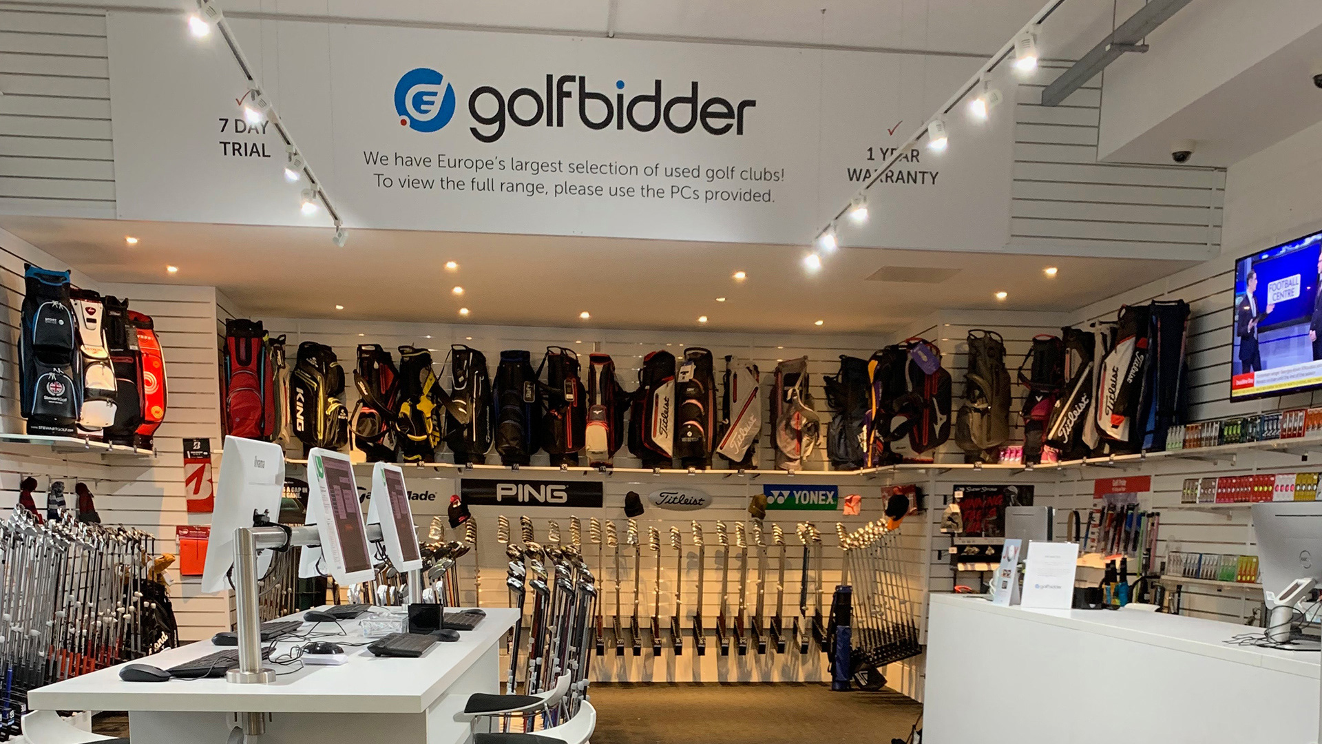

The Surrey based golf retailer approached us to reinvigorate and modernise their brand mark after 8 years of living with their previous iteration. (Also designed by Other Media.) We needed to make sure that the mark worked as well on screen as it would printed on marketing collateral, signage and shop uniforms.
Tasked with challenging them, we proposed a series of radical departures from their existing image. Despite many interesting and promising visual results it was soon clear that a gentle evolution of the existing solution was going to work better for them and their existing customer base.
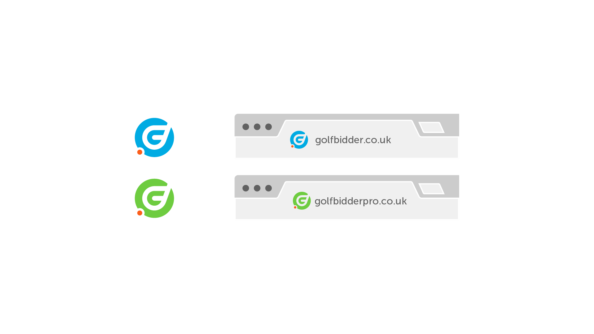
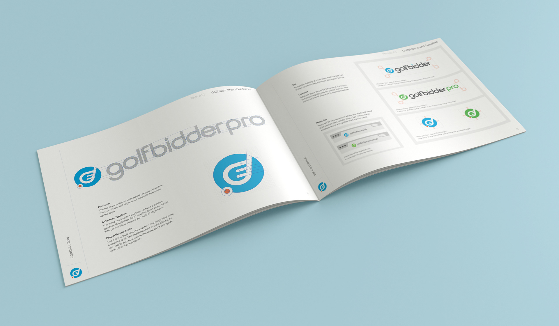
Our solution drew on the graphical club element that was blended within the previous typographic word mark. We pulled it out, redrew it based around a set of geometric principles, creating stronger lines and sharper angles.
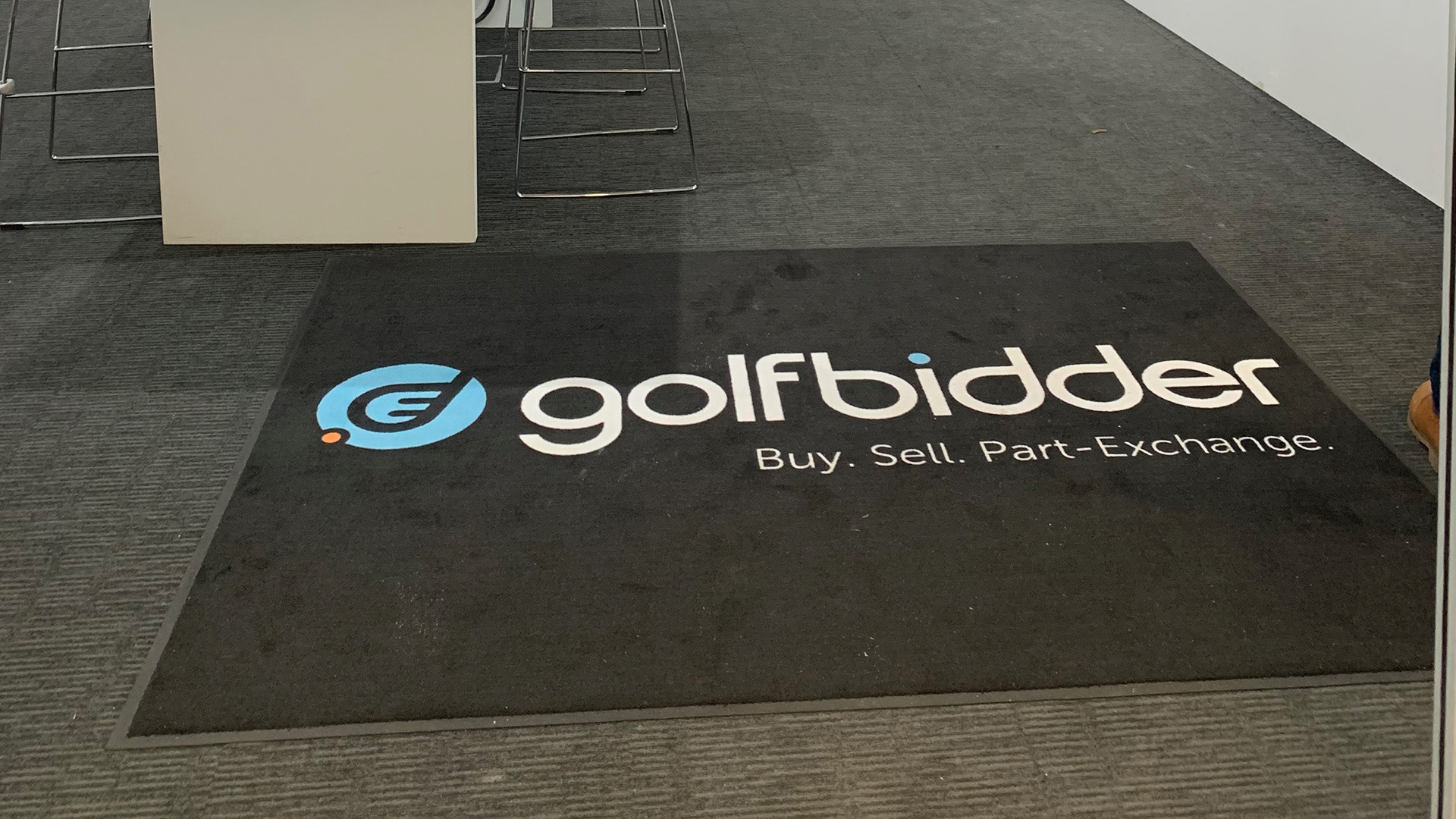
The mark was extended for the sub brand 'Golfbidder Pro' with a new palette and the 'pro' suffix built from the custom typography that was crafted using the same geometric principles as the ident itself. A full set of brand guidelines was drawn up along with printed stationary and examples of brand application.