
When the team at Crit-IQ initially approached us, their identity and their current site were outdated and was driving home negative connotations of the organisation, shrouded in black, red and illegible, it needed sprucing up.
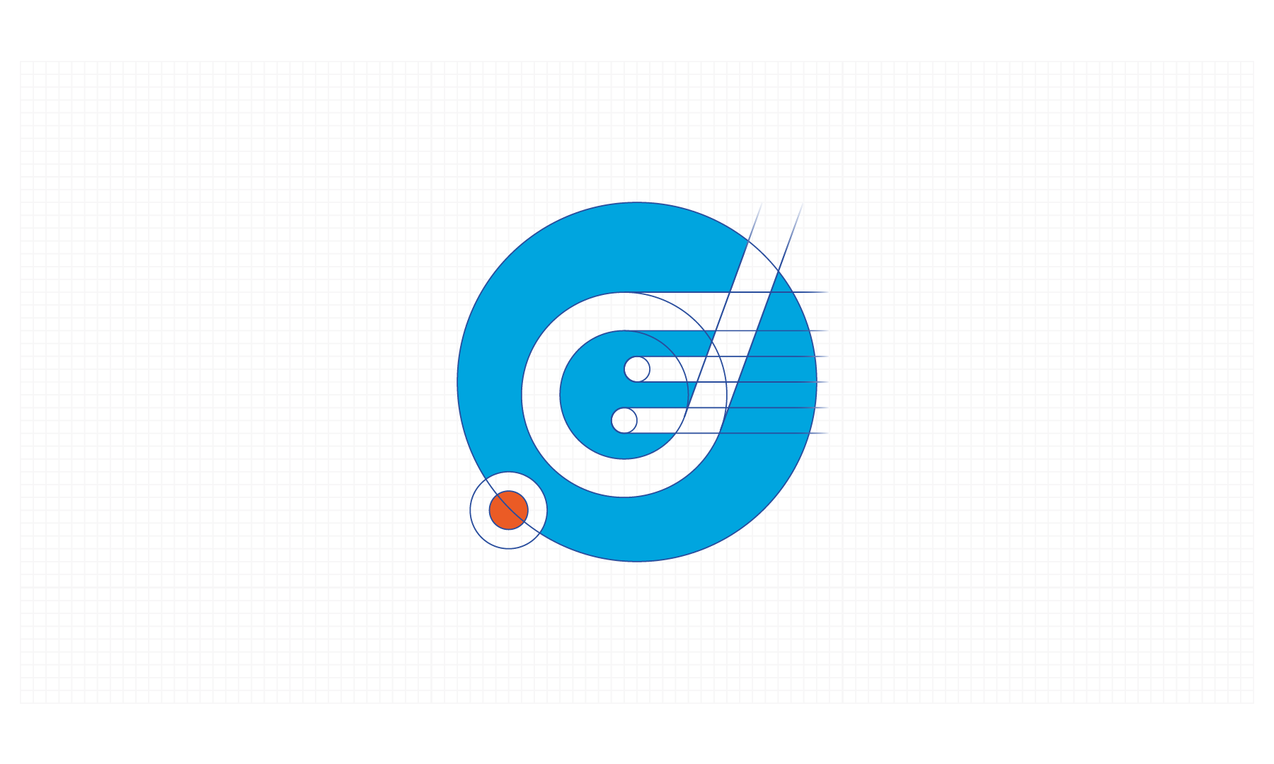
The amoeba ident that sat alongside the word mark was well recognised within medical circles and this was required to stay, after all it was a beautiful shape and complimented the brand wholeheartedly. Upon first observations we realised that the current mark was not symmetrical and felt unbalanced, it was thinner and didn't speak with the confidence that we knew the organisation had.
From initial sketches and a rough illustrator construction. We carefully refined and reconstructed the amoeba based off of circles and a mathematical principle where everything scaled from our master circle in the centre. This gave the amoeba a more solid appearance, that would hold up better at small sizes and work equally as well in negative, atop imagery or as stand alone mark.
The palette was altered reflect the gowns worn by medical professionals, with a complimentary sub palette that retained a tweaked version of their original red. The typeface updated and chosen for its geometric construction, gives Crit-IQ a highly legible mark that due its large counters works well at its minimal sizes.
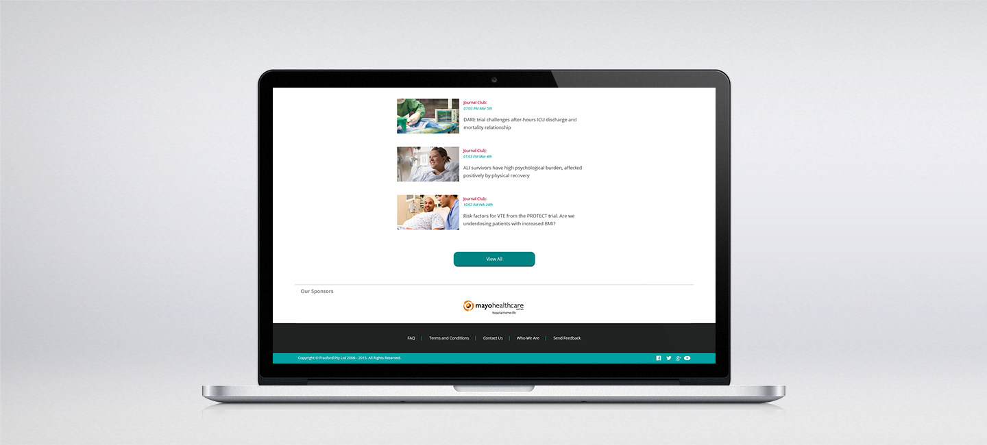
Full guidelines were drafted up and a new responsive site was proposed, with development underway. One of the key areas, which sought improvement was the member logbook which now boasts responsive charts and allows doctors to document their training and procedures in a visual way that helps to aide their development.